
After receiving Carol Nevius's story from my publisher, Marshall Cavendish, I began by creating thumbnail sketches for the entire book. The rhyming story centers on activities that take place during a typical hour-long soccer practice. The title page, dedication page spread and end page eventually changed, but these were my original thumbnail sketches. The text was slightly tweaked later as well, but the original story that I received is dropped in below the thumbnails.

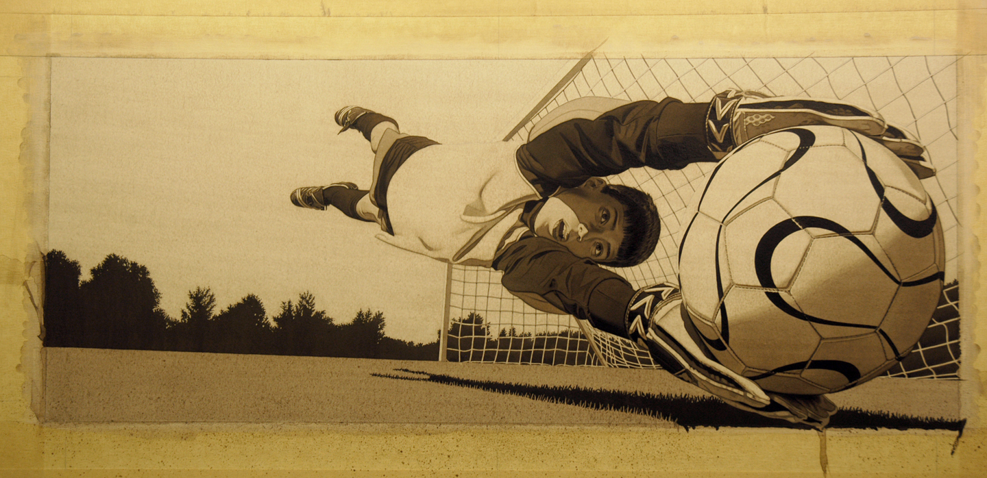
The spread from page 20/21 (later selected to also be used as the cover image) will be the focus of this process demonstration. Notice that nothing important is located in the middle of the image since that is where the book will fold (known as the "gutter"). I also left "dead space" in the upper right for the placement of the text.

I began by shooting reference photos of a variety of children. One of my models was my nephew, Matt, who happens to be a soccer star in Indiana. Rather than have Matt dive a couple of hundred times while I shot photos, laying him on a picnic table gave me enough visual information to draw a convincing dive and was easier on him. His legs also appeared on other children for all of the kicking illustrations in the book.
Since none of my children are soccer players, Matt was also a great resource for soccer information for me. Additionally, I watched numerous soccer videos and spoke with soccer coaches to have a firm understanding of the correct body positions that I would be representing. I selected different photos that contained individual elements that I really liked.

Next, I shot reference for a ball and goal, making sure that the light source and perspective was consistent on all the shots.

Looking at the best parts from all my reference photos, I created a detailed pencil drawing, playing with the scale of the various elements to create one dynamic diving figure. I also added an extra inch of art on all sides (called bleed) that will be trimmed when the art is published. Then I transferred my drawing onto a piece of Hot Press Crescent Watercolor Board and sprayed it with Krylon Workable fixative. I also decided to flop the image so the action of the image would read from left to right. Originally, I had no idea that my publisher would later want this as the cover image, but my nephew was very excited to appear on the cover.

Next, I created a mixture of gesso, yellow ochre and black acrylic paint, and mixed with water to a milky consistency. I painted the entire drawing with a wash of this base color to remove all the white areas and provide a warm gray ground to paint on. On top of this, I began laying in some of the dark values with a mixture of black, yellow ochre and burnt umber acrylic paint. Although the image will be largely monochromatic, I wanted the shades of grey to be somewhat warm and more rich than diluted black. I rarely use colors staright out of the tube and like to create my own mixtures.

Then I painted over the entire surface with a mixture of lamp black, yellow ochre and burnt sienna oil paint mixed to a watery consistency with mineral spirits. After allowing to dry to the touch, I began erasing out the areas of light with a kneaded eraser.

This adds base mid-tone values, and more importantly, a wonderful subtle texture to the entire board. One of my goals for Soccer Hour was create illustrations that had a little more texture than my previous books- to play with the balance between rough somewhat abstract textures and tightly rendered forms.

Then I painted over the entire surface again with a mixture of black, yellow ochre and burnt umber acrylic paint. I use the paint very thin and slowly build up washes to their final values. I also masked off the ground and splattered the surface with a toothbrush to add additional texture. I did this on all the grass throughout the book.
In Soccer Hour, the balls are emphasized as the focal point with color. Additionally, the practice jerseys also needed to have color accents to remain consistent with the text. I tried to keep the use of color more understated on the jerseys so the brighter ball would remain the focus. These colors were also acrylic paint.

And finally, I went over everything one last time using Prismacolor Colored pencils. This brought out the highlights and added further polish to the finish. I always do color tests, and French Grey pencils blended well with the warm grey acrylic tones that I had previously painted.

And here is the entire image as published on the cover:

Soccer Hour is scheduled for release in February of 2011 and will be available at booksellers everywhere.
That is amazing work and to see how it's done makes it even more impressive!
ReplyDelete